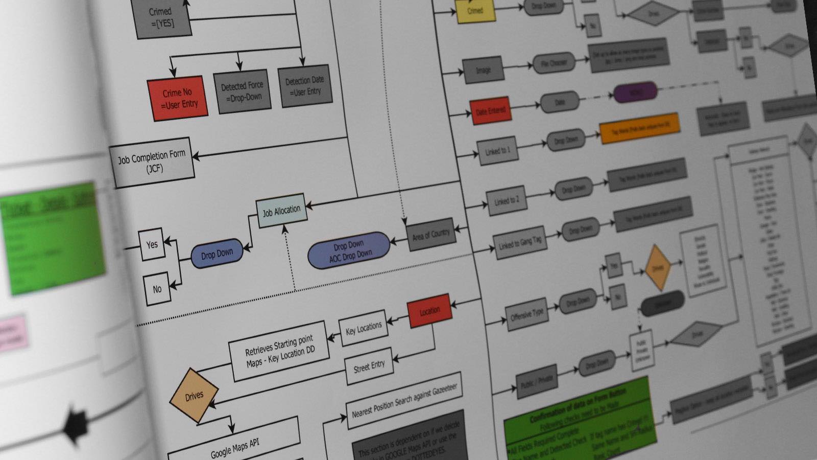
As we have been discussing content on a website is extremely important. However, a website should wow a user on entry to ensure that there attention is captured straight away .
A good mix of both is the only way forward, unless you are relying on external factors of advertising such as Google Adwords, Press or even TV advertising.
Here are some general rules to consider as you create or update your site:
Be Consistent
Cool plugins, flashy boxes and a bunch of blinking lights that don’t have much function prove more distracting than appealing to users, although you as the designer or website owner mght believe that they are super things to have. If you are in any doubt, keep your site simple, easy to navigate using the three click rule, and ensure that all drivers are aimed to the solution that your client will be searching for.
Legible text.
Dont be tempted to go the DARK SIDE. Standards show people read black text on a white background over 30 percent faster.
Useful content.
If your content is not useful to your client then you will lose them through complicated firectional links and over populated pages.
}
